
From Idea to Brand: How I Designed the TechNaldo Character
How do you turn a tech blog into something that feels human? In this behind-the-scenes TechNaldo post, we explore the thinking, design choices, and intentional decisions behind creating the TechNaldo character — from personality and tone to visual restraint and brand evolution. A grounded look at why good branding starts with clarity, not hype.
Most people think branding starts with visuals.
Colors. Fonts. Logos. Maybe a mood board if you’re feeling fancy.
That’s the visible part. But it’s not the real beginning.
The real beginning is a feeling.
Before TechNaldo ever had a face, a hoodie, or a pair of futuristic glasses, it had a question attached to it:
How should this feel to someone encountering it for the first time?
Not “how should it look.”
Not “how can it stand out.”
Just how it should feel.
Because tech already feels cold enough. Another abstract logo wasn’t going to fix that.
Why Branding Matters More Than We Admit
We like to pretend branding is superficial.
Something layered on after the “real work” is done. A polish step. A nice-to-have.
That’s rarely true.
Branding shapes expectations before a single word is read. It decides whether something feels approachable or intimidating. Trustworthy or performative. Calm or loud.
Especially in tech.
Most tech brands lean into one of two directions:
hyper-minimal and sterile
overly loud and hype-driven
Both create distance.
One feels inaccessible. The other feels exhausting.
TechNaldo was never meant to sit in either camp.
The Problem With How Tech Usually Presents Itself
Look at most tech blogs and platforms.
They rely on abstraction.
Icons instead of people.
Dashboards instead of faces.
That works for products. It doesn’t always work for explanations.
When everything feels optimized and faceless, curiosity turns into intimidation. People stop asking questions because they don’t want to feel behind.
That was the gap TechNaldo was built to fill.
If the goal was clarity, the brand itself needed to signal approachability from the start.
Starting With Personality, Not Design
Before thinking about visuals, I wrote down a few non-negotiables.
TechNaldo had to feel:
curious, not preachy
confident, not arrogant
calm, not frantic
informed, not performative
Just as important: what it shouldn’t feel like.
Not corporate.
Not “fellow kids.”
Not a hype machine.
Not a doom prophet.
This wasn’t about being neutral. It was about being grounded.
The personality came first. The character followed.
Why a Character Instead of a Traditional Logo
This decision raised eyebrows.
Characters can feel childish if done wrong. Mascots can slide into gimmicks quickly.
But characters also do something logos can’t.
They create a point of view.
A character gives the brand:
a consistent voice
a human anchor
emotional continuity across topics
Instead of a floating entity talking at readers, TechNaldo could feel like someone exploring ideas with them.
That mattered.
Because tech isn’t just about tools. It’s about how people relate to those tools.
A character makes that relationship easier to enter.
Designing the Personality Before the Face
Before sketching anything, I asked simple questions.
How would TechNaldo explain something complicated?
Would they rush or slow down?
Would they oversell or understate?
Would they admit uncertainty?
The answers shaped everything.
TechNaldo doesn’t rush explanations.
It doesn’t pretend certainty where there isn’t any.
It reacts like a real person encountering new tech — curious, sometimes skeptical, occasionally impressed.
That tone now shows up everywhere:
in the writing
in the visuals
in the pacing of content
Consistency matters more than cleverness.
Making Tech Feel Human Without Dumbing It Down
One of the hardest balances to strike was this:
Be approachable without being condescending.
There’s a fine line between simplifying and oversimplifying. Between friendly and patronizing.
TechNaldo needed to assume the reader is smart — just busy.
That mindset shaped the character’s demeanor.
Relaxed posture.
Open expressions.
Curiosity instead of authority.
Nothing about the design screams expertise. And that’s intentional.
Expertise shows up in clarity, not posture.
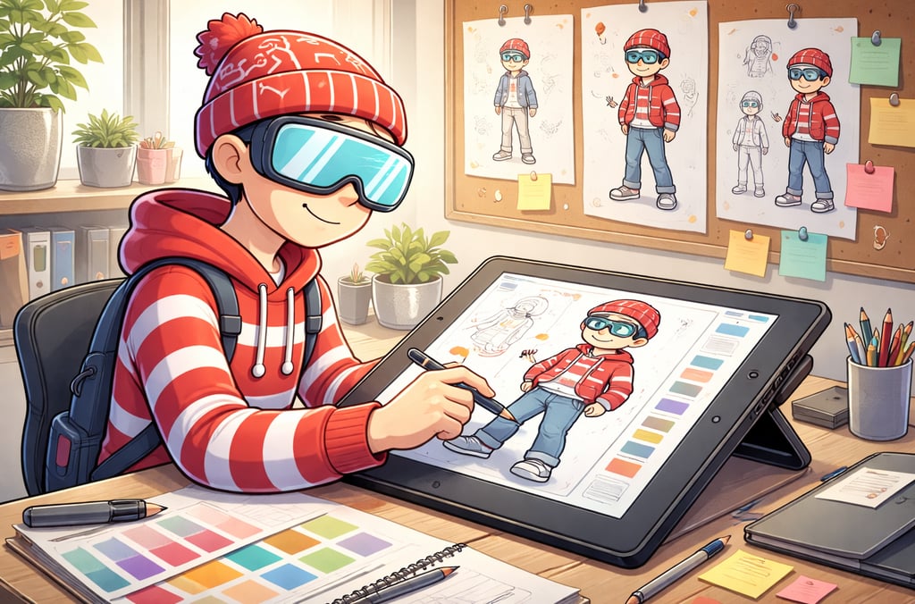
Visual Decisions That Actually Mattered
Once the personality was clear, the visuals had direction.
The hoodie wasn’t about style. It was about comfort.
The glasses weren’t about spectacle. They signal curiosity.
The backpack suggests exploration, not performance.
Everything needed to feel usable.
No extreme cyberpunk aesthetics.
No sterile lab vibes.
No overwhelming interfaces floating everywhere.
The future here isn’t loud. It’s integrated.
That’s why the color palette stays grounded. Why lighting feels soft. Why scenes often show TechNaldo interacting thoughtfully instead of commanding attention.
Why TechNaldo Avoids “Main Character Energy”
This was deliberate.
TechNaldo isn’t the star of the show. The ideas are.
The character exists to guide attention, not absorb it. To make concepts easier to engage with, not to dominate the frame.
That’s why:
gestures feel exploratory
expressions stay calm
tech elements never overwhelm the scene
The character doesn’t perform tech. It evaluates it.
That subtle difference keeps the brand from sliding into hype.
Iteration: What Didn’t Work at First
The first versions weren’t perfect.
Some designs leaned too futuristic.
Others felt too casual.
A few tried too hard to signal “tech.”
They all missed the same thing.
They felt like costumes instead of perspectives.
Once I noticed that, the fixes became obvious. Strip back. Simplify. Keep what supports the idea, remove what distracts.
Branding isn’t about adding until it looks impressive. It’s about removing until it feels right.
Refining Through Context, Not Just Taste
One mistake people make with branding is judging it in isolation.
Logos look great on white backgrounds. Characters look great in mockups. But brands live in context.
Articles. Thumbnails. Feeds. Long-form reading.
Seeing TechNaldo next to actual content changed decisions fast. Anything that pulled attention away from the writing had to go.
The brand exists to support understanding — not to compete with it.
How the Character Supports the Content
This is where everything clicked.
TechNaldo isn’t just decoration. It reinforces the message before the reader even starts reading.
A calm character suggests calm explanations.
A curious pose suggests exploration.
A grounded environment suggests realism.
That alignment builds trust quietly.
Readers don’t think about it consciously. They just feel it.
That’s good branding.
What Designing TechNaldo Taught Me About Tech
Designing this character mirrored how good technology should work.
Start with intent.
Build for humans.
Iterate based on use, not ego.
Simplify until friction disappears.
The same mistakes show up in tech and branding:
building for demos instead of daily use
prioritizing flash over function
mistaking complexity for depth
TechNaldo exists as a small protest against that mindset.
Branding Isn’t About Being Static
One important thing: TechNaldo isn’t finished.
And it shouldn’t be.
A brand that never evolves becomes a costume. A character that never adapts stops feeling real.
As tech changes, the character will too — slowly, intentionally, and with reason.
That evolution is part of the story.
The Quiet Goal Behind the Design
The real goal of TechNaldo’s design isn’t recognition.
It’s comfort.
Comfort asking questions.
Comfort admitting confusion.
Comfort sitting with uncertainty.
If the brand does its job, readers won’t think about the design much at all. They’ll just feel like they’re in good company while thinking through complex ideas.
That’s the kind of future tech needs more of.
One Last Thought
Good branding doesn’t shout who you are.
It shows how you think.
TechNaldo exists to make tech feel less distant, less performative, and more human — not by simplifying the ideas, but by respecting the people engaging with them.
That started with a character.
But it only works because the intention came first.
Subscribe to my newsletter